Chinaco Tequila
SPECULATIVE DESIGN
Challenge
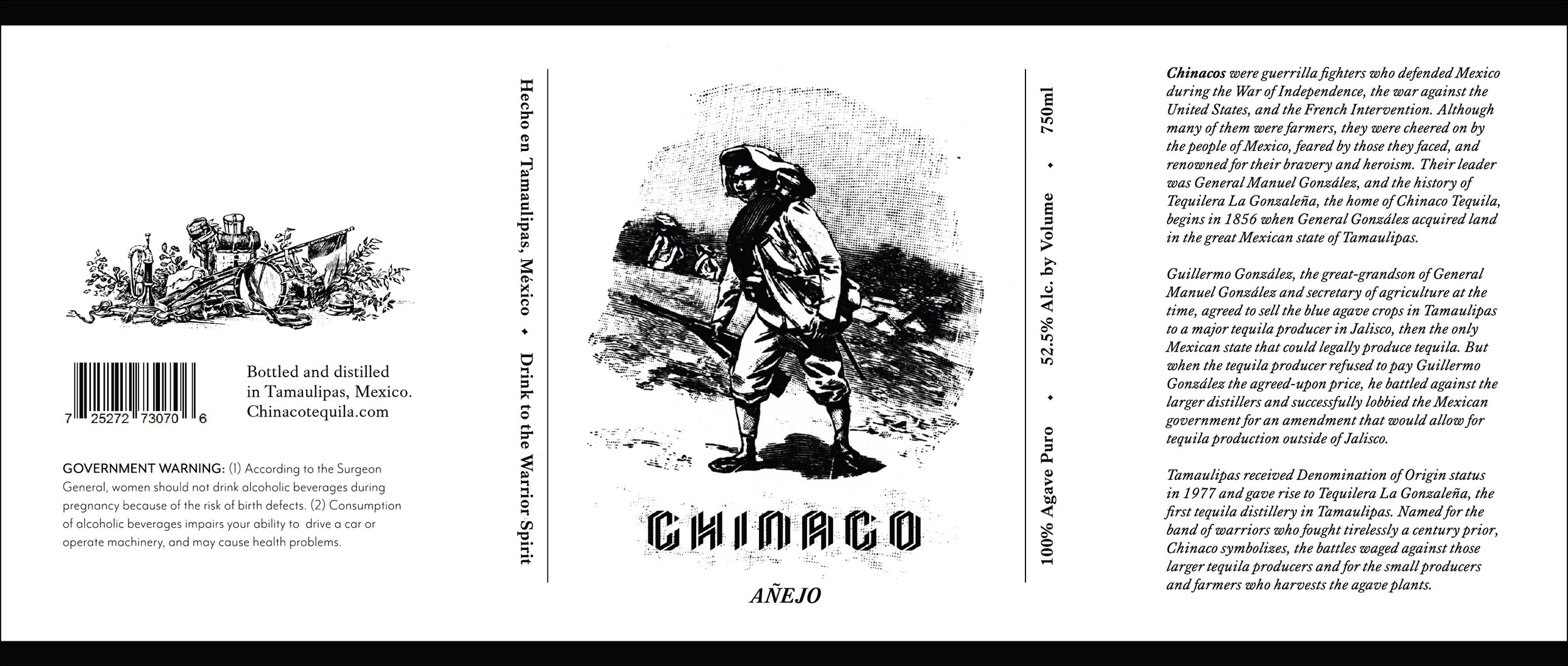
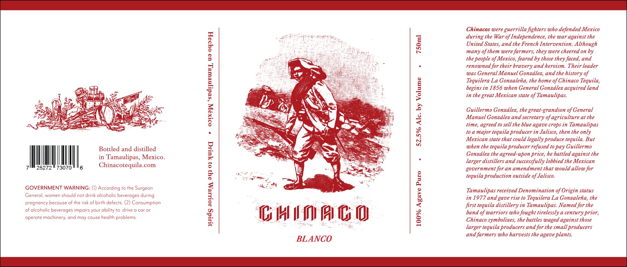
An observation into Chinaco Tequila’s origins revealed a compelling opportunity to explore a refreshed identity that brought the brand’s storied past into a contemporary light. Named after the Chinacos, legendary irregular horsemen who fought for Mexican independence, the brand carries a legacy of defiance, skill, and pride. These cattle ranchers turned warriors, led by General Manuel Gonzalez in the mid-1800s, were known for their martial spirit and flamboyant presence. Despite the depth of its backstory, the existing brand identity left room for visual storytelling that could better reflect its historical roots and bold character. The exploration centered on creating a new visual language that could evoke Chinaco’s fierce independence and authenticity in a modern marketplace.
Solution
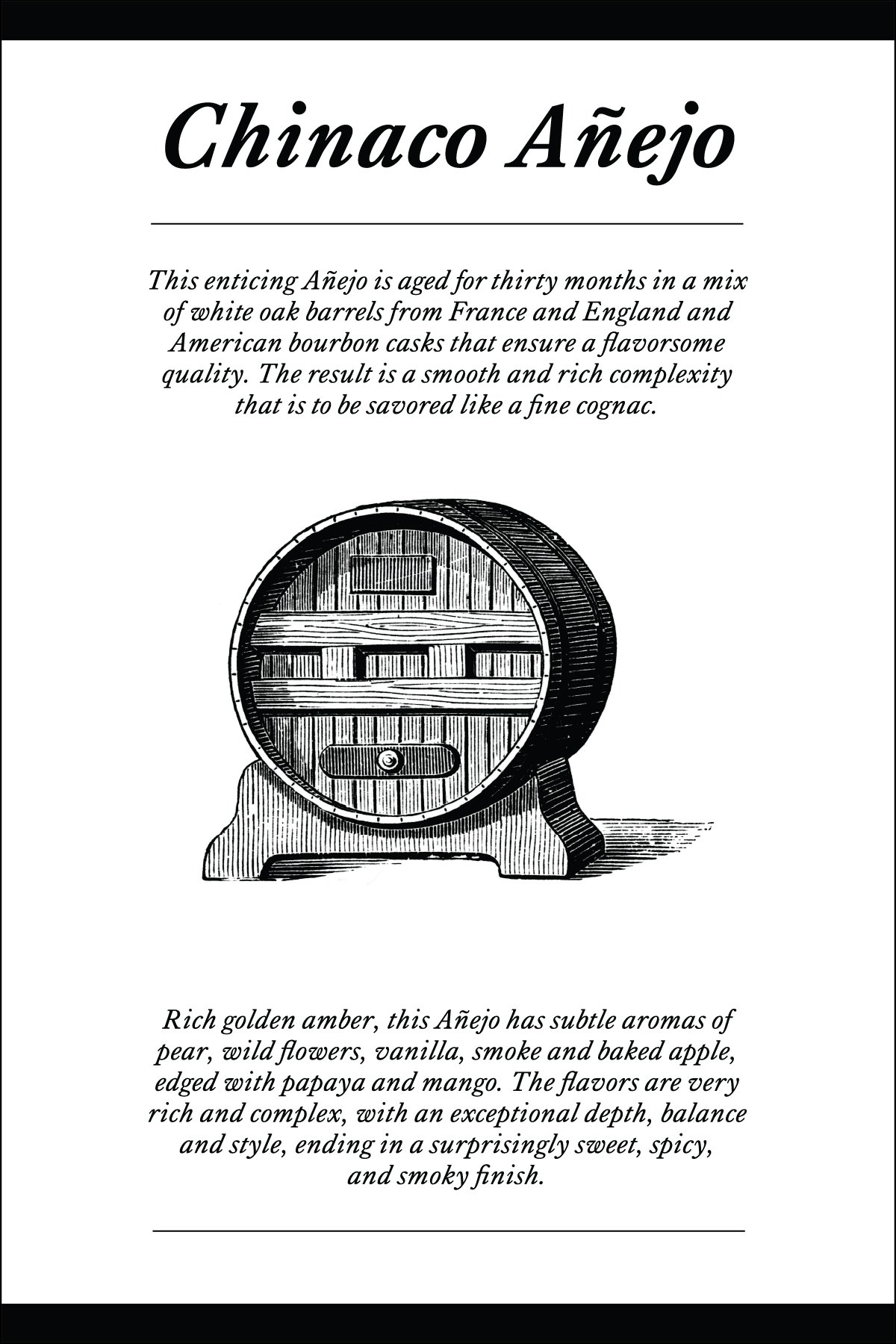
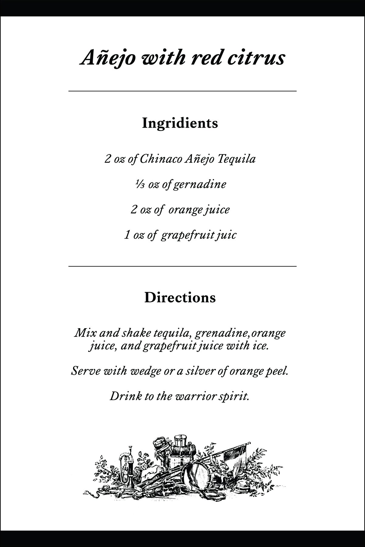
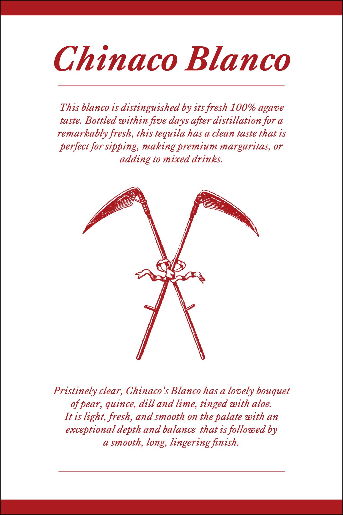
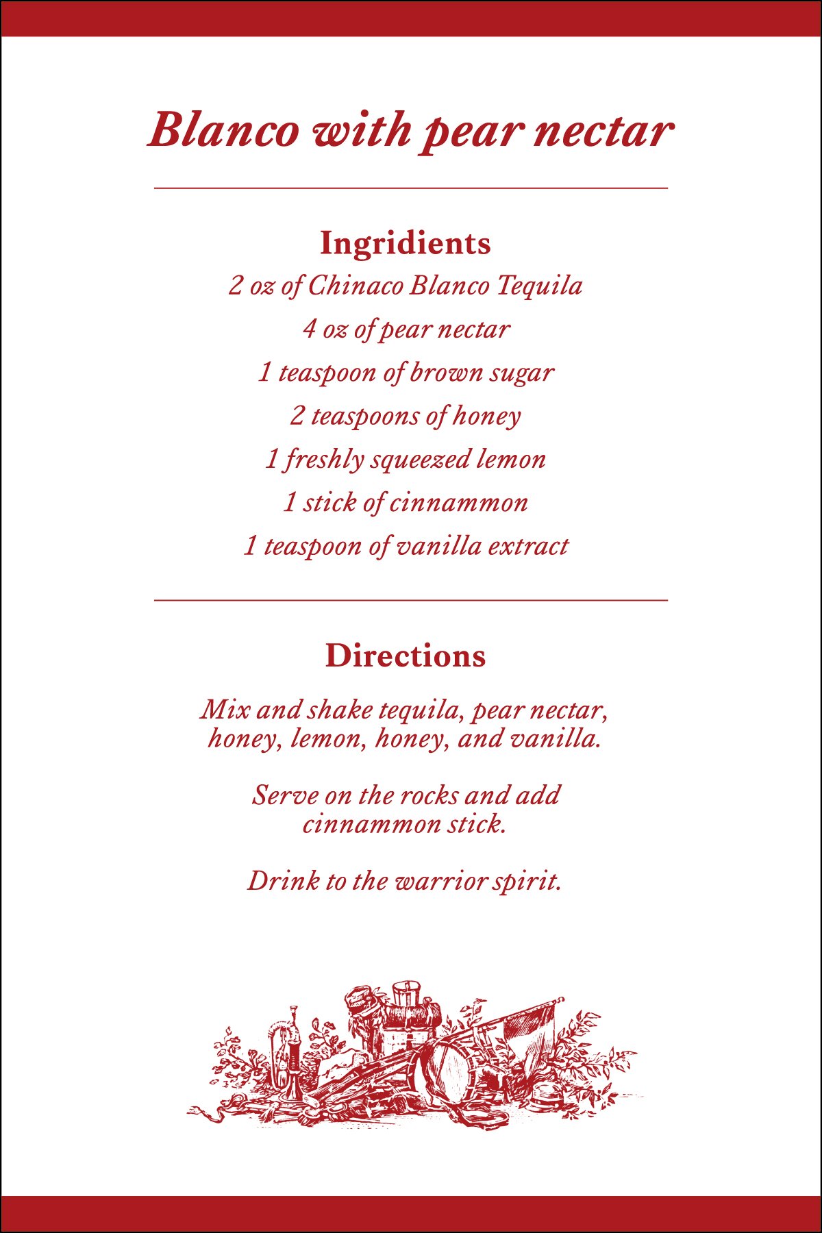
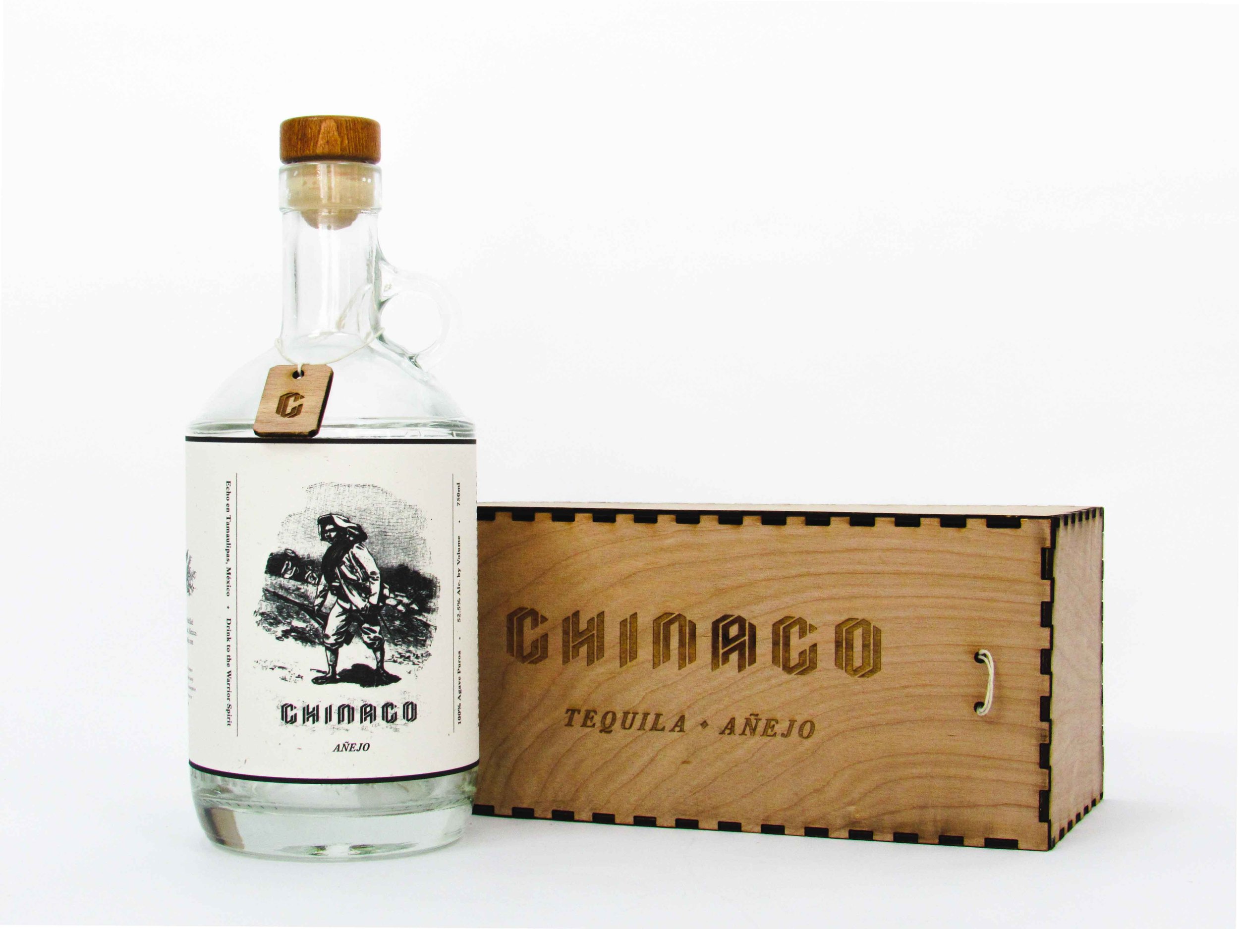
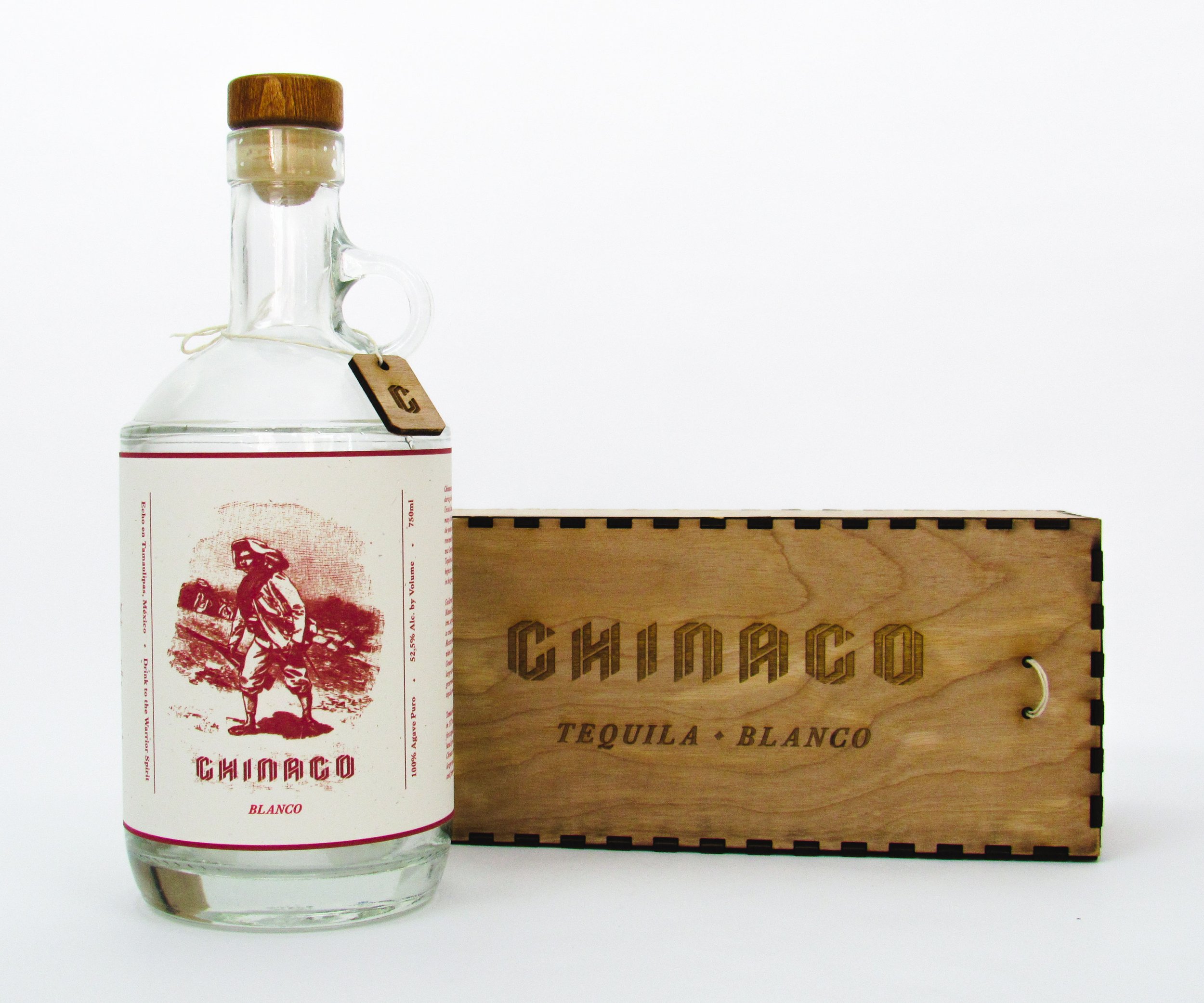
A new geometric sans-serif logo was designed to be sharp and unconventional to mirror the rugged elegance of the Chinaco fighters. Then, tactile elements were used to tell the product’s story: handcrafted chips from the barrels were placed around each bottle, paired with wooden boxes and rope-textured handles reminiscent of traditional ranching gear. Moonshine-style jugs reinforced the handcrafted, humble origins of the spirit. Finally, the visual storytelling came to life through educational callouts, a symbolic color system for each tequila type (red for blanco, black for añejo, green for reposado), and drink menus featuring tools from the tequila-making process. The final sign-off, “Drink to The Warrior Spirit,” encapsulated the bold tones envisioned for the rebrand.