

The Edge
PIZZA HUT • PACKAGING
Challenge
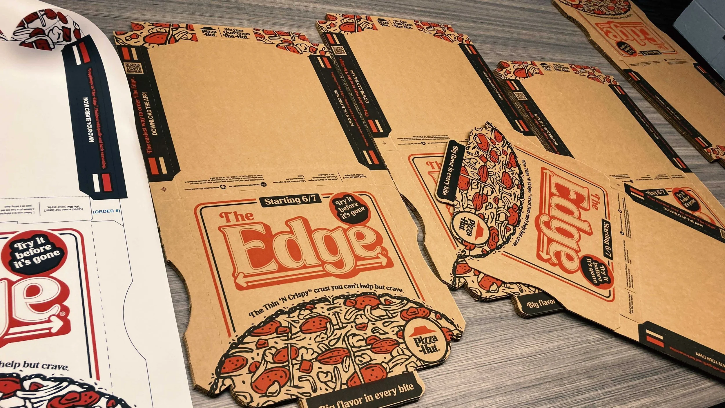
After a successful limited-time run, The Edge pizza had clearly won some fans but it turns out a lot of people still didn’t know what made it so good. Was it the crispy thin crust? The square cut? The fact that the cheese and toppings went all the way to the edge with no crust in sight? The answer was yes. The challenge was getting those details in front of more eyes to help new customers understand what they were getting and why it was different. With the buzz already building from the first launch, this next phase was all about turning curiosity into craving and first-timers into loyal fans.
Solution
The solution was simple: show exactly what makes The Edge awesome, right on the box. The key visual breaks past the edges of the packaging (just like the pizza does), making that no-crust concept loud and clear. Framed by double bars, the layout adds depth while subtly nodding to Pizza Hut’s iconic look from the 1980s. An illustrated approach was used to showcase standout features like fresh ingredients, bold toppings, the seasoned edge, and the recognizable square cut. The design wasn’t just about visual appeal—it was crafted to communicate the product’s story at a glance, helping customers immediately understand what sets The Edge apart.
Credits
Creative Director: Jordan Hoyt
Ass. Creative Director: Sarah Holmes
Sr. Art Director: Hannah Zach
Copywriter: Scott Allen


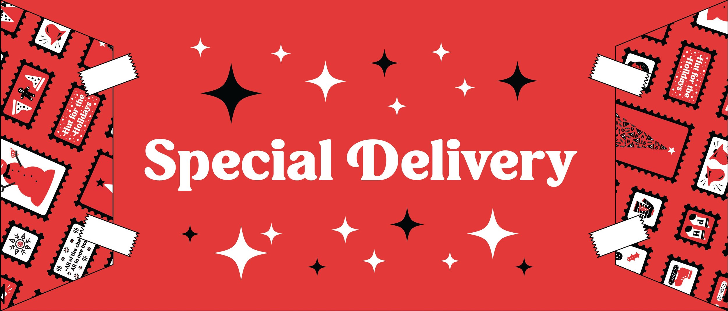
Triple Treat Box
PIZZA HUT • PACKAGING
Challenge
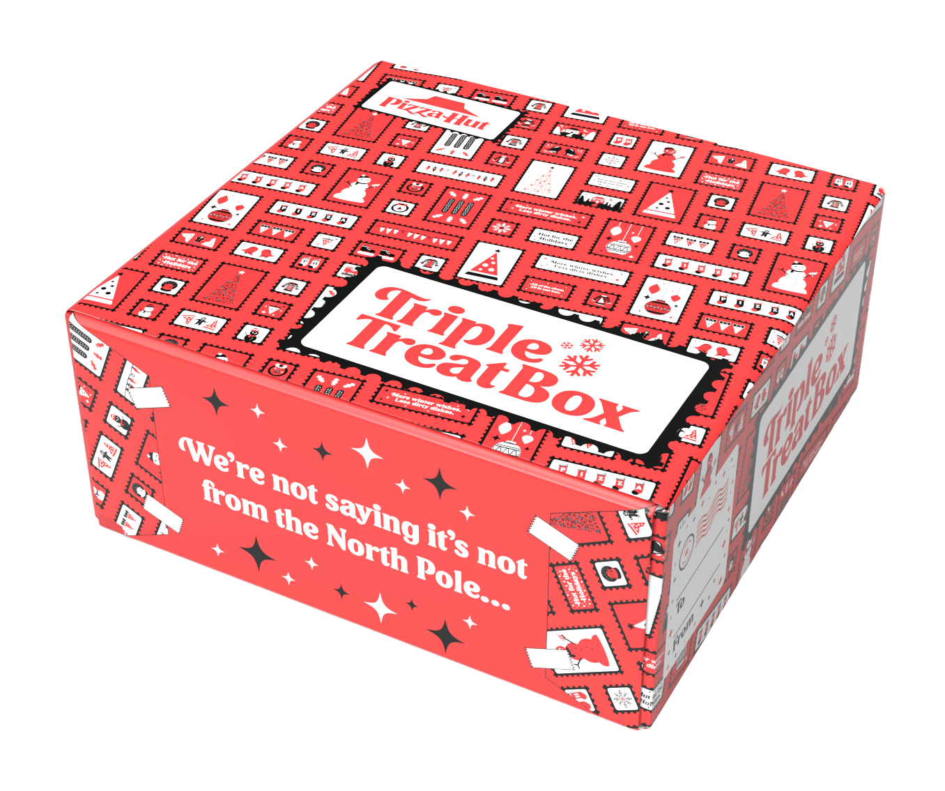
Each year, Pizza Hut’s Triple Treat Box brings a festive bundle of comfort: two medium 1-topping pizzas, five breadsticks, and ten cinnamon sticks starting at just $19.99. This year, the focus was on turning this holiday favorite into something even more memorable like a gift-ready experience that could be easily shared, passed along, or presented at any festive occasion. With the holidays centered around giving, joy, and connection, the design needed to feel instantly seasonal, visually fun, and simple to use as a thoughtful, ready-to-give surprise. The result was a packaging system that didn’t just carry food, but delivered holiday cheer in a format anyone could enjoy handing off.
Solution
The packaging solution came together through three main design choices. First, the outer sleeve served as the “gift wrap” since it is printed on paper that mimics the look and feel of quality wrapping paper, complete with a whimsical “To/From” postage label. Second, the sleeve design featured a collection of custom holiday postage stamps, each one playfully reimagined with Pizza Hut flair: snowmen munching pizza, the iconic Hut nestled in a snow globe, stockings that spelled out P-I-Z-Z-A, and so on. Finally, printed graphic tape details wrapped around the box to enhance the illusion of a carefully wrapped present. Altogether, the refreshed Triple Treat Box made it easier than ever to spread holiday joy with no gift bag required.
Credits
Creative Director: Jordan Hoyt
Sr. Art Director: Hannah Zach
Copywriter: Scott Allen


Gen-Z Initiative
PIZZA HUT • PACKAGING
Challenge
Pizza Hut sought to connect with a younger audience through a fresh limited-time packaging concept, aiming to build loyalty among Gen Z consumers. While the brand holds nostalgic value for older generations, many younger customers see it as outside their price range and lacking in cultural relevance. With no retro roots to leverage, the strategy turned toward current trends and shared interests. Astrology, with its rising popularity among Gen Z as a form of self-expression and community building, offered the perfect theme. The challenge became finding a way to blend the cosmic and the craveable in a way that felt authentic, not gimmicky, to an audience that values personality, detail, and meaning in the brands they engage with.
Solution
The result was an astrology-themed pizza box built to surprise and delight fans of the zodiac. The top featured a bold celestial wheel — a full pizza sliced into twelve pieces, each one representing a different zodiac sign, with matching symbols stamped onto the crust. Inside each slice, constellation patterns were cleverly formed from pizza toppings, a hidden detail designed to reward the truly astrology-obsessed. The box embraced internet-native language, using phrases like “Pizza is my sign” and “You manifested. The universe delivered,” creating a wink to online humor and spiritual memes. Together, these choices helped turn standard packaging into a shareable experience, tailor-made for an audience hungry for both flavor and meaning.
Credits
Creative Director: Jordan Hoyt
Sr. Art Director: Hannah Zach
Copywriter: Scott Allen


