The Edge
Pizza Hut Packaging
Art Direction • Packaging • Print Production • Illustration
The Challenge
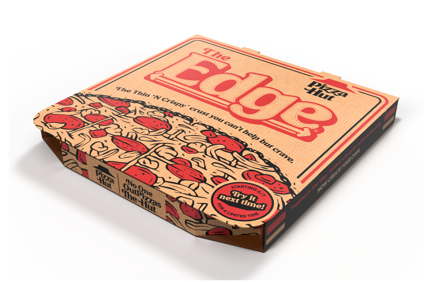
After a successful limited-time run, The Edge pizza had clearly won some fans but it turns out a lot of people still didn’t know what made it so good. Was it the crispy thin crust? The square cut? The fact that the cheese and toppings went all the way to the edge with no crust in sight? The answer was yes. The challenge was getting those details in front of more eyes to help new customers understand what they were getting and why it was different. With the buzz already building from the first launch, this next phase was all about turning curiosity into craving and first-timers into loyal fans.
The Solution
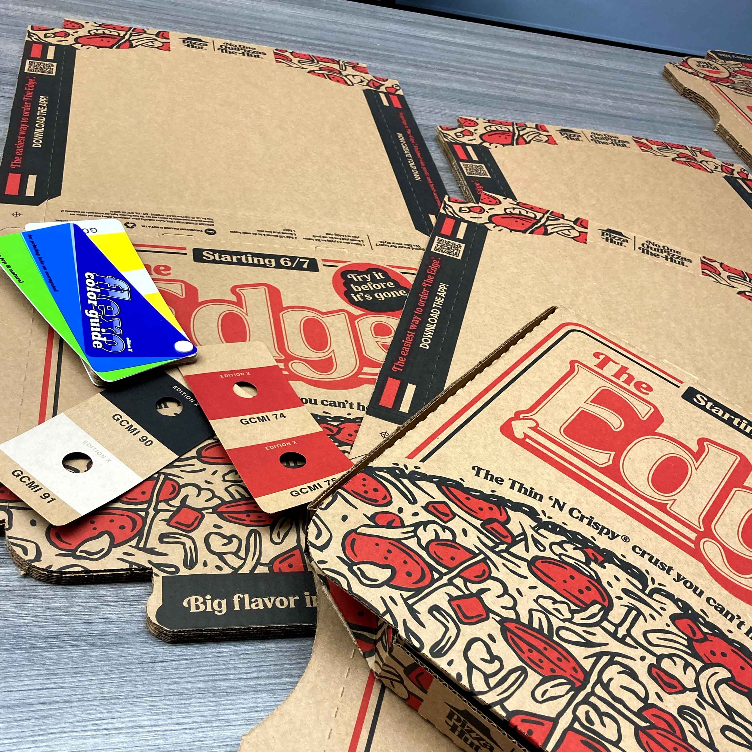
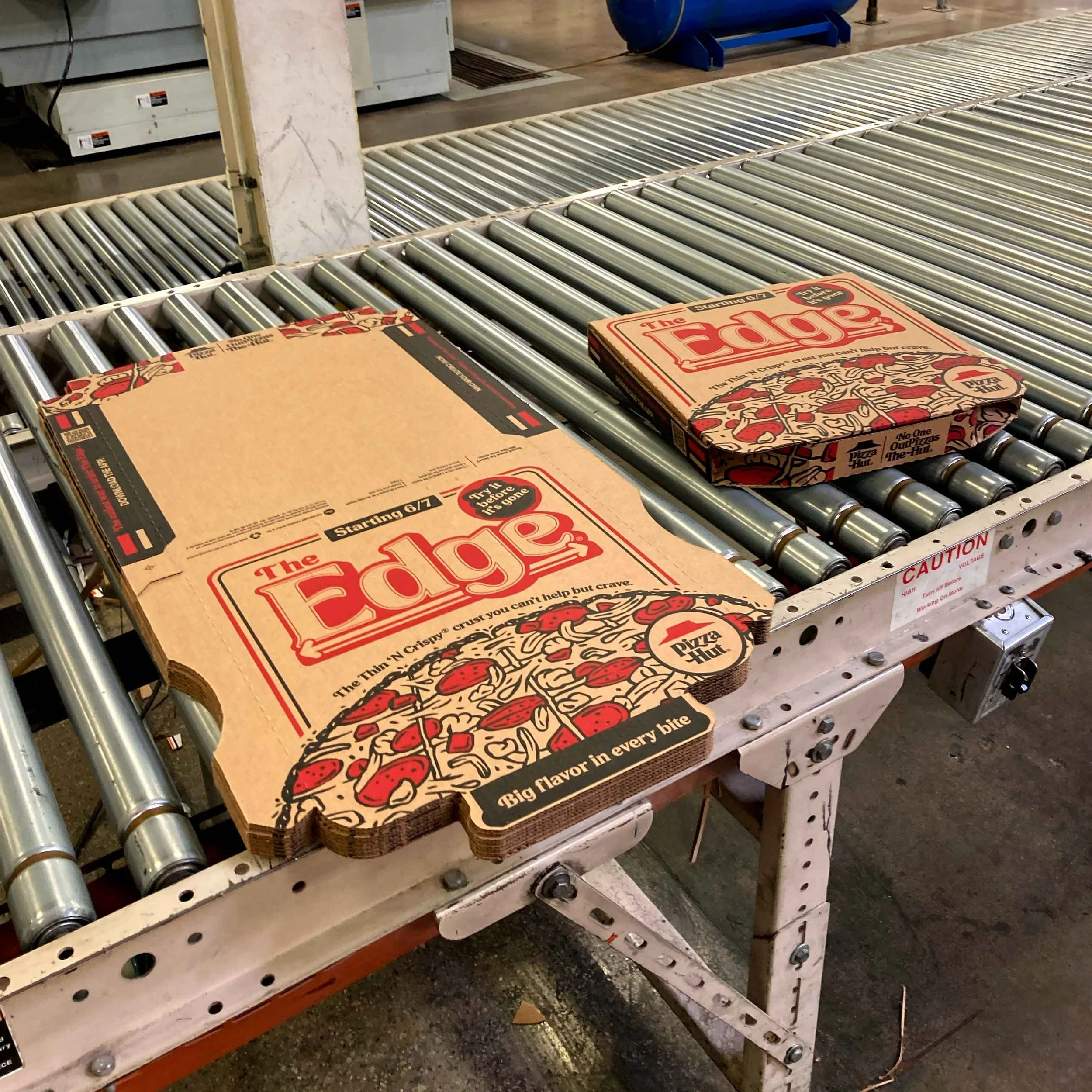
The solution was simple: show exactly what makes The Edge awesome, right on the box. The key visual breaks past the edges of the packaging (just like the pizza does), making that no-crust concept loud and clear. Framed by double bars, the layout adds depth while subtly nodding to Pizza Hut’s iconic look from the 1980s. An illustrated approach was used to showcase standout features like fresh ingredients, bold toppings, the seasoned edge, and the recognizable square cut. The design wasn’t just about visual appeal—it was crafted to communicate the product’s story at a glance, helping customers immediately understand what sets The Edge apart.
Team
Creative Director:
Jordan Hoyt
Ass. Creative Director:
Sarah Holmes
Sr. Art Director:
Hannah Lewis
Copywriter:
Scott Allen
Client
Pizza Hut
Agency
TracyLocke
Role
Art Director
Year
2022